
Building a comprehensive emergency reporting system
Role
Product Designer
Timeline
Aug - Dec 2023
Supervisor
Gabriella Wong, Founder & Executive Director
Tool
Figma
ABOUT ACCESSOS
accesSOS, a Berkeley-based startup, aims to close critical gaps in the 911 system by enabling individuals with verbal communication barriers to report emergencies seamlessly.
However, navigating emergency reporting without verbal communication can be overwhelming, especially in high-stress situations. The scope included simplifying the onboarding flow and auditing the design system, enabling users to quickly and accurately convey critical information while reducing cognitive load.

THE ASK
How might we streamline emergency reporting to quickly capture critical details and relay them to responders effectively?
INTRODUCING THE NEW EMERGENCY REPORTING FLOW

THE CHALLENGE
In order to build a comprehensive system that empower users to confidently and accurately communicate emergencies, accesSOS was looking for a design revamp that addressed the following:
Simplify the reporting interaction — focus on four common emergency types—Medical, Police, Mental, and Fire—to understand user motivations and expectations, particularly in choosing one emergency type versus two.
Reduce cognitive load — pay attention to the users' emotional journey while reporting a time-sensitive wellness report and simplify the icon searching process to match symptoms to emergencies.
With these points in mind, we focused on the main flow of emergency detail reporting and conducted 20-minute usability testing sessions on emergency details screens, assessing user satisfaction with the icon presentation order and the number of options for each emergency type.
BREAKING DOWN ACCESSOS’ FLOWS
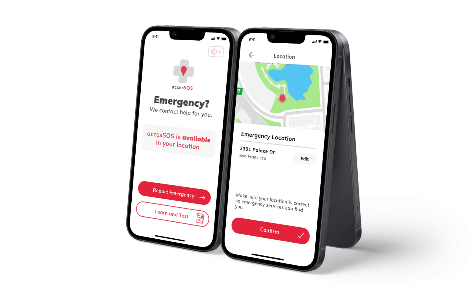
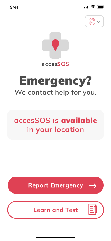
STEP 1: Report your location


STEP 2: Describe your emergency


STEP 3: Review info and contact help


HOW DID WE SIMPLIFY THE PROCESS?
UI Icon Library
User Flow
Our team aimed to simplify the process, experimenting iteratively with copywriting and information hierarchy.
For copywriting, we revised the instruction heading from 'Can you describe your emergency?' to the more intuitive 'Select all that apply.' In terms of layout, we explored strategies like dropdown menus and tabs to minimize scrolling and enhance user comprehension. These refinements were crucial steps in addressing user feedback and optimizing the emergency reporting experience.
In terms of visual design, we successfully streamlined the icon library, reducing the total number of icons from 36 to 30, while ensuring clarity in categorization, distinguishing between people and objects, motion, and idleness.

From a UX perspective, we achieved significant milestones:
1) Condensing the onboarding process from five steps to two, extracting vital information about the emergency's location and the presence of weapons
2) Introducing sub-categories for a more efficient emergency details list navigation
3) Incorporating input fields at the end of each emergency details page, empowering users to provide relevant information seamlessly.


ON ACCESSIBILITY
During the prototyping phase, meticulous attention was given to elements such as color contrast, information hierarchy, and the selection of legible typefaces, while adhering to WCAG standards.
The consultation with accessibility professionals and dispatchers played a crucial role in shaping a universal design that not only met regulatory standards but also respected and embraced diverse perspectives. This collaborative effort ensured that the final design was not only accessible but also reflective of an inclusive and considerate approach to user experience, meeting the needs of a wide range of users.
REFLECTIONS & TAKEAWAYS
Exploring the emergency reporting process was both challenging and rewarding, with user testing playing a pivotal role in shaping the project's direction. Our focus on simplifying the flow, considering users' mental and emotional states, and incorporating universal design principles defined the iterative design process.
Rather than viewing universal design as a one-time achievement, I recognize it as a continuous process that evolves with society, adapting to new technologies and contexts.

Meet the team!

Showcase
Next Story
Design system for grassroots movements
Researched 350 Bay Area’s volunteer community’ goals and motivations for engagement and designed a 24-page brand book to rebrand the rallying movement.
Read →